-
New Portal for Himalayan Region Aims to Provide Better Environmental Data
›
“There was drought so we had to share the little water brought a long distance from irrigation canals to the field. This delay in rice planting is resulting in a late harvest,” explains Ratna Darai, 47, a farmer in Daraipadhera, Nepal, during an interview with The Third Pole reporter Ramesh Bhushal. An erratic monsoon means an uncertain harvest in a nation where agricultural production is not on pace with population growth. Water insecurity is a major driver of conflict and uncertainly in the world’s most populous continent.
-
Understanding Climate Vulnerability: José Miguel Guzmán on How Census and Survey Data Can Help Us Plan
›
“Population-related data from census, surveys, and other administrative data can and must be used for adaptation to climate change,” says José Miguel Guzmán in this week’s podcast from the launch of The Demography of Adaptation to Climate Change. As the devastation from Typhoon Haiyan shows, population density, poverty levels, and even building construction quality can have a huge impact on how vulnerable a particular area is to extreme weather, flooding, and other effects of climate change.
-
“See What Story the Data Tells”: PAI’s Gina Sarfaty on Mapmaking With a Purpose
›
“Maps are inherently compelling because they contain a high resolution of information and most people have really been trained since grade school on how to read a map,” says Population Action International mapping specialist Gina Sarfaty in this week’s podcast.
-
ECC Platform
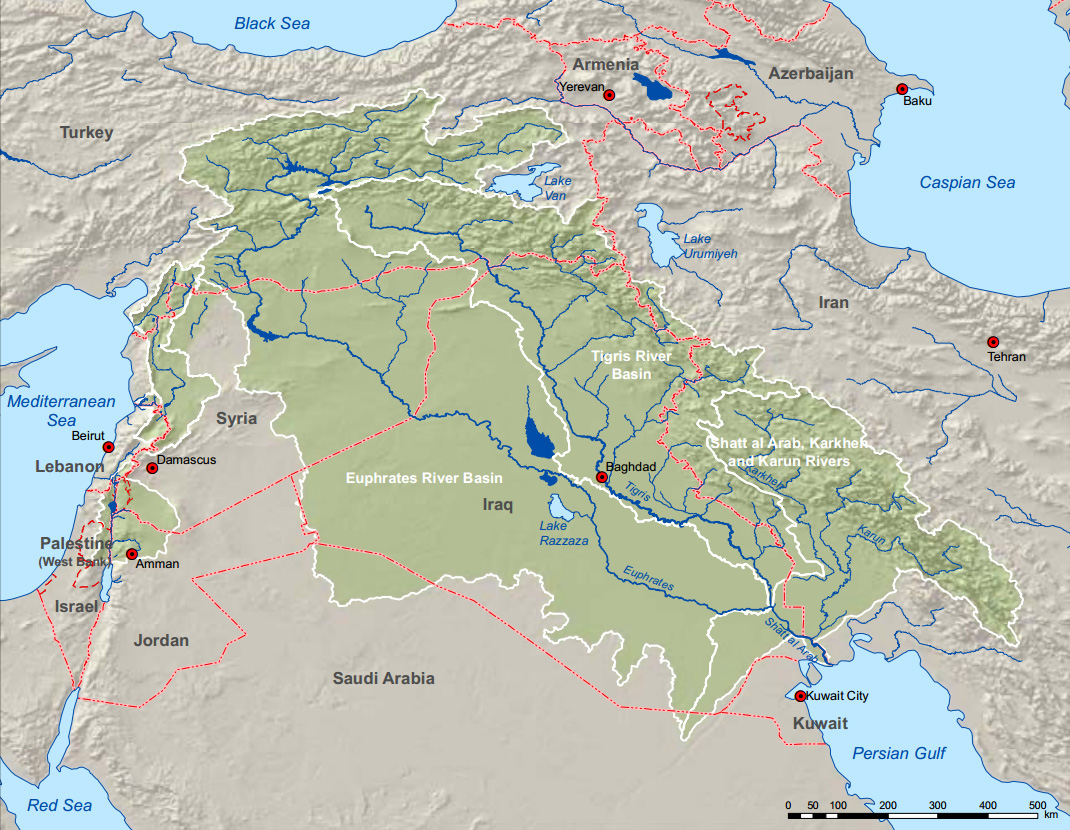
Data for Peace: Inventory of Shared Waters in Western Asia
›October 1, 2013 // By Wilson Center StaffThe original version of this article appeared on the Environment, Conflict, and Cooperation (ECC) Platform.
The Environment, Conflict, and Cooperation team talked to Eileen Hofstetter from the Swiss Agency for Development and Cooperation. She is co-author of the Inventory of Shared Water Resources in Western Asia released at this year’s World Water Week in Stockholm. The Inventory was prepared by the United Nations Economic and Social Commission for Western Asia and the German Federal Institute for Geosciences and Natural Resources.
-
Mark Montgomery: More Data on Urban-to-Urban Migration Needed
›
“If I ask you to consider the image in your mind of a migrant girl, probably you – like me – have a vision of a girl embarking from a rural village on a trek to the city,” says Mark Montgomery of the Population Council in this week’s podcast. But, “Is that what the empirical realities show?”
Perhaps not: “It is far more common for urban and migrant girls to come from other cities and towns than it is for them to come from rural villages,” he explains.
-
PRB’s 2012 World Population Data Sheet
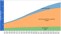
› “The most rapid population growth in many ways [occurs in] the countries that can least afford it,” said Carl Haub in a webinar on July 19 to launch the Population Reference Bureau’s (PRB) 50th annual World Population Data Sheet. This year, the report explores aging populations in more developed countries, rapid population growth in less developed countries, and the increased global prevalence of non-communicable diseases in an interactive map, which concisely illustrates global trends. PRB estimates that the world’s population is 7,057,075,000 as of mid-2012; the global population crossed the seven billion threshold in October 2011.
“The most rapid population growth in many ways [occurs in] the countries that can least afford it,” said Carl Haub in a webinar on July 19 to launch the Population Reference Bureau’s (PRB) 50th annual World Population Data Sheet. This year, the report explores aging populations in more developed countries, rapid population growth in less developed countries, and the increased global prevalence of non-communicable diseases in an interactive map, which concisely illustrates global trends. PRB estimates that the world’s population is 7,057,075,000 as of mid-2012; the global population crossed the seven billion threshold in October 2011.
“The most rapid population growth in many ways [occurs in] the countries that can least afford it,” said Carl Haub in a webinar on July 19 to launch the Population Reference Bureau’s (PRB) 50th annual World Population Data Sheet. This year, the report explores aging populations in more developed countries, rapid population growth in less developed countries, and the increased global prevalence of non-communicable diseases in an interactive map, which concisely illustrates global trends. PRB estimates that the world’s population is 7,057,075,000 as of mid-2012; the global population crossed the seven billion threshold in October 2011.
Aging Europe and East Asia
Haub explained that population growth in Europe has been declining since the 1970s and is more or less a “pre-programmed destiny” for these countries. People of child-bearing ages make up a smaller percent of the population in many more developed countries, so unless there is an “enormous increase” in total fertility rates, these populations will continue to decline for the foreseeable future.
Haub noted that these aging populations are unprecedented. In Germany and Italy, for example, 21 percent are over the age of 65; many other European countries have similar figures, as do other developed countries like Japan and South Korea. PRB expects these percentages to increase throughout the next century and for European countries to struggle to support greater numbers of retirees.
Many such states have already found it difficult to raise the retirement age, even though medical advances allow people to work until later ages. PRB projects that in Japan, 42 percent of their population will be over the age of 60 in 2050; if such a large percentage of the population is no longer in the labor force, it will be difficult for to find the resources to support them.
The report shows that the United States, on the other hand, is still experiencing modest population growth. The higher birthrate is in part due to immigration, as recent immigrants to the United States tend to have more children. Haub noted that European states have been reluctant to accept greater numbers of migrants to try to reverse their declining population.
Youthful Developing Countries
While the demographic destiny of aging countries is somewhat determined, the future for less developed countries is more uncertain. Many countries in sub-Saharan Africa, the Middle East, and South Asia have large and growing youth populations, and how many children these “future parents” will have is uncertain. That uncertainty is underscored by the variety of scenarios for future population growth. The UN has four variants – high, medium, low, and constant fertility – which vary considerably in their projections for future populations, and PRB’s global projections for 2050 are some 600 million people more than the commonly-used medium variant UN projection.
Rapid growth in the least developed countries is hardly a new phenomenon, but PRB breaks down the numbers to an impressive degree. The 2012 Data Sheet provides updated net migration rates, projected population as a multiple of today’s, infant mortality rates, rate of natural increase, and other basic statistics. PRB also provides population pyramids from the wealthiest and poorest quintiles of the population of Malawi, as an example of the utility of desegregating data to better allocate resources to the underserved. They found that while birthrates have begun to decline for the wealthiest one-fifth of Malawians, the poorest citizens still have a total fertility rate of over seven children per woman.
Measuring Health Systems
Devastating infectious diseases – malaria, tuberculosis, and HIV/AIDS – have long been entrenched in some of the least developed and most rapidly growing parts of the world. But this year, PRB began to assess health on a broader level by tracking deaths attributed to non-communicable diseases as well. Diseases like cardiovascular disease, diabetes, respiratory illness, and cancer are leading causes of death in developed countries, but they have also increased in prevalence in developing countries at an alarming rate.
PRB is not the only organization to take note of the change in disease predominance. The World Health Organization has issued guidelines targeting four factors which increase the risk of these illnesses: tobacco use, alcohol abuse, poor diet/obesity, and physical inactivity. The UN also called a special session last September to discuss non-communicable diseases. President of PRB Wendy Baldwin noted that the last such discussion on a health issue was 10 years ago about HIV/AIDS.
Baldwin also pointed out that non-communicable diseases can increase the burden on the health systems of developing countries even more so than in developed states. She reported that in south Asia, for example, people have heart attacks on average six years earlier than people in developed countries, meaning more families lose their primary breadwinners.
The risk factors for these non-communicable diseases are difficult to target, especially with increasing urbanization in developing countries. But in a video accompanying the report, Baldwin mentioned that raising the price of cigarettes is an effective way to reduce tobacco consumption, especially for youth. Some countries have also made progress in increasing physical activity through sports programs and making urban areas safer for pedestrians. “The low and middle income countries have a real opportunity to take really positive steps to confront that rise in non-communicable diseases and to address the risk factors that drive them,” she said.
The Data Sheet Over Time
The World Population Data Sheet has long been a vital resource for those in the population, health, and environment fields and has grown to include far more data than its first iteration in 1962. At first, the sheet had only four indicators: a population estimate for the year, annual rate of increase, crude birth rate, and crude death rate. Over time, PRB began measuring a greater number of key figures like infant mortality and life expectancy at birth. Population projections, a staple of the current version, were not added until 1978, perhaps in response to the inception of the United Nations World Population Projections in 1974.
Over the past five decades, the data sheet has been witness to some major shifts in global population trends. While PRB discourages researchers from comparing past data to current figures because the measures and methods of gathering information have likely changed over time, it is still possible to see the rise of importance in several trends based on the indicators PRB chose to focus on each year. For example, extremely young populations have been found to have profound effects on a country’s stability and prosperity, as have aging populations. The 1966 data sheet was the first to measure the percentage of the population under the age of 15, and it didn’t become a consistent data point until 1977.
The number of people living in cities in the developing world surpassed those in the developed in 1970, according to the UN, and in 1972, PRB began tracking the percentage of populations living in urban areas. HIV/AIDS indicators were added in 2000, as global awareness and a commitment to fighting the disease was rising.
PRB’s demonstrated commitment to continually adding more data and refining existing projections makes the data sheet is a valuable resource to those studying the problems of today and the future. Fifty years on, the amount of information collected is staggering. The data sheet provides a glimpse at not just how many people there are in the world, but also where and how they live.
For more information, take a look at the full data sheet!
Sources: Population Reference Bureau, UN Population Division.
Image Credit: PRB; Video: Noncommunicable Diseases and Youth in Developing Countries. -
Open Data Initiatives at USAID Reflect Move Towards Collaboration, Enabling Efforts
›Over the past year and a half, USAID has been busy reinventing itself. The announcement of its USAID FORWARD initiative and the release (jointly, with the State Department) of the first Quadrennial Diplomacy and Development Review in late 2010 signaled significant changes for the organization, including several reforms designed to modernize operations and improve transparency. Part of that effort is making data collection and dissemination more open.
Thus far, the results have been encouraging.
September of last year saw the launch of an awareness campaign focused on the Horn of Africa, co-sponsored by the Ad Council and called, somewhat confusingly, USAID FWD (famine, war, drought). As part of the program, USAID published a collection of regional maps, aggregating the organization’s substantial data pool and showing everything from food and water security to the movement of refugees and IDPs (internally displaced persons).
Using data from its own FEWS.NET site, USAID created the maps with open-source tools, allowing other organizations and concerned individuals to leverage the data for additional aid and outreach activities. Many, including the ONE Campaign and InterAction, were quick to incorporate the maps and underlying data into their own activities.
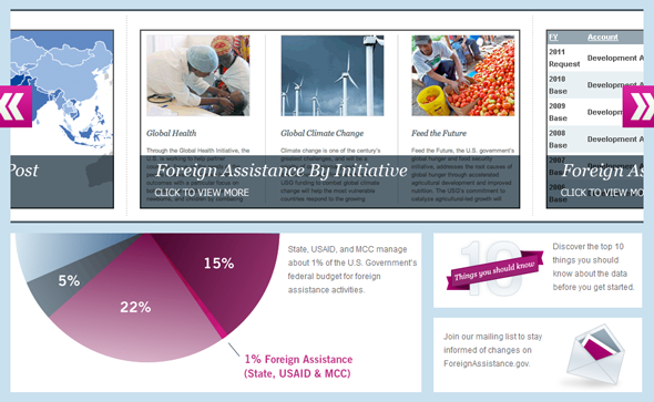
In order to promote greater data access and transparency, USAID also collaborated with the Department of State to create the Foreign Assistance Dashboard, a website that provides sortable aid budget allocation data to the general public. Launched in late 2010 with frequent updates since, the site allows users to see easily how aid is apportioned by region, sector, initiative, or other categories.
For instance, visitors can see that USAID more than quadrupled its humanitarian assistance to Pakistan in 2010 as a result of that country’s devastating flooding. Aid then fell back to near 2009 levels the following year.
Recently, USAID has also taken its open data efforts to the Web. Faced with 117,000 records of development loans provided by its own Development Credit Authority and lacking proper geographic coding, the organization undertook a pioneering experiment in crowdsourcing this June. Civilian volunteers from the online technical communities GISCorps and the Standby Task Force pitched in to help code the data, as did unaffiliated citizens attracted by social media campaigns.
The end results were outstanding: the volunteers finished the job in just 16 hours, although USAID had initially expected the operation to take 60.
Representatives from USAID recently published an illuminating case study about the crowdsourcing experiment and launched it at the Wilson Center. “By leveraging partnerships, volunteers, other federal agencies, and the private sector, the entire project was completed at no cost,” the report noted, adding that USAID hoped to have “blaze[d] a trail to help make crowdsourcing a more accessible approach for others.” One of the case study authors, Shadrock Roberts, noted that “we need to be working as hard to release relevant data we already have as we are to create it.”
USAID’s recent experiments with transparency and greater civilian participation appear to be part of a larger organizational shift toward greater openness and collaboration. Administrator Rajiv Shah seemed to confirm this in a March interview with Foreign Policy, when he spoke at length about the benefits of partnering with the private sector as well as other NGOs.
The recently reported demise, or at least great diminishing, of President Obama’s Global Health Initiative (GHI), which closed its doors amid a heated turf battle between USAID, the State Department, and PEPFAR, lends credence to this theory as well. The official GHI blog stated last week that it would “shift focus from leadership within the U.S. Government to global leadership by the U.S. Government.” This appears to indicate greater future emphasis on collaboration, with an eye toward enabling non-USAID actors to play a greater role in the development process.
It remains to be seen how USAID’s role and strategy will change over the next few years. However, results from the organization’s initial attempts at open data and open government policies have been positive in many respects, and there is reason to hope they will continue to push the boundaries in these areas.
Sources: Center for Global Development, Foreign Assistance Dashboard, Foreign Policy, Global Health Initiative, USAID.
Image Credit: Foreign Assistance Dashboard. -
USAID Turns to Crowdsourcing to Map Loan Data
›
The original version of this article, by Aaron Lovell, appeared on the Wilson Center’s Science and Technology Innovation Program Commons Lab blog.
On June 28, officials from USAID met at the Wilson Center to discuss a recent experiment in using crowdsourcing to help clean up and map data on development loans. The agency had 117,000 records on private loans made possible by their Development Credit Authority, which theoretically could be mapped and made available to the public. The problem? Location data for the loans was not standard and was difficult to parse. USAID decided to turn to “the crowd” and recruit interested volunteers from the Standby Task Force and GISCorps – two online volunteer communities – to help clean the data, making it available for additional analysis.
Shadrock Roberts, Stephanie Grosser, and D. Ben Swartley – all with USAID – discussed the results of the project. They were able to clean up the information at virtually no cost to the government, noting that they hope it will be an example for further collaboration between government and engaged volunteers.
“Our hope is that the case study will provide others in government with information and guidance to move forward with their own crowdsourcing projects. Whether the intent is opening data, increased engagement, or improved services, agencies must embrace new technologies that can bring citizens closer to their government,” the officials wrote in a recently released case study focused on the exercise. While the exercise resulted in high-quality output, Roberts et al. did provide advice for other agencies considering similar work. Grosser stressed the need to “crawl, walk, [then] run” – that is, start small with a few hundred records and then expand on that, as the system is refined.
But USAID sees crowdsourcing becoming a key part of improving government data. “We need to be working as hard to release relevant data we already have as we are to create it,” Roberts concluded, when discussing how the experience could apply more generally. “The crowd is willing to do research, data mining, and data cleanup.”
Sources: USAID.
Showing posts from category data.


 “The most rapid population growth in many ways [occurs in] the countries that can least afford it,” said Carl Haub in a webinar on July 19 to launch the Population Reference Bureau’s (PRB) 50th annual


