Showing posts from category Eye On.
-
Measuring Ecosystem Vitality and Public Health With the Environmental Performance Index
›The Environmental Performance Index (EPI) is a comparative analytic tool for policymakers created jointly by Yale and Columbia Universities in collaboration with the World Economic Forum and Joint Research Centre of the European Commission. The EPI was created in 2006 and is updated biannually. Data is drawn from 25 performance indicators that fall under 10 well-established policy categories, including the environmental burden of disease, the effects of water on human health, and agriculture. The indicators serve as a “gauge at a national government scale of how close countries are to established environmental [and health] policy goals,” write the authors.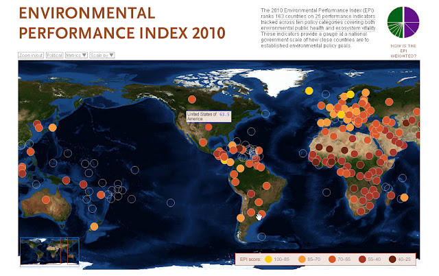
The EPI draws data from a diverse array of sources, such as the World Health Organization, Food and Agriculture Organization, University of New Hampshire, and World Resources Institute. Users can view visualizations of the compiled data via an interactive map and the data is also available in the form of rankings charts, individual country profiles, and country group comparisons. The interactive map also allows users to isolate performance indicators or policy categories in order to compare an individual country’s performance with global trends. Furthermore, indicators may be scaled to visually reflect a country’s performance in relation to drivers of environmental performance, like gross domestic product, level of corruption, and government effectiveness.
This tool is particularly useful because users can effectively leverage points for policy change by identifying linkages between environmental policy and other issue areas, such as public health or sanitation. The EPI enables policymakers to visually conceptualize problematic regions, optimize investments in environmental protection, and identify best practices.
The index’s greatest weakness is its inability to track changes in performance over time. A pilot project was launched last year that tracks whether a country has progressed or deteriorated in an area of environmental performance, but the authors note that the project has “raised more questions than answers,” particularly concerning data availability and interpretation. Additionally, there are gaps in the data. Although these gaps signify a data quality weakness, they also support the continued calls for increased data collection by governments and other organizations to better inform environmental decision-making. -
Watch: Janani Vivekananda on Climate Change and Stability in Fragile States
›At International Alert, the starting point for thinking about how climate change affects stability is recognizing that climate change will interact with and amplify existing social, economic, and political stressors in fragile communities, said Janani Vivekananda in this interview with the ECSP.
“Rather than climate change being this single, direct causal factor which will spark conflict at the national level,” Vivekananda said, these stressors “will shift the tipping point at which conflict might ignite.” In places that are already weakened by instability and conflict, climate change will simply be an additional challenge.
To address this additional challenge, Vivekananda said two things must be understood about the effects of climate change on fragile states: 1) Environmental, social, economic, and political stressors will be most evident at the household and community level; and 2) Those stressors are interrelated.
“You can’t address one of these things in isolation from the others. You have to understand how they all interact together to be able to respond appropriately,” she said. “We can’t think about food security, for example, without thinking about land degradation.” In addition, responses need to be relevant to their context, and that context “can only be understood through very sub-national, context-specific evidence.” Vivekanada explained that this kind of evidence can only come from a “bottom-up” approach, which should be coordinated as part of a broader effort.
For more on the connections between climate change and stability, see The New Security Beat’s summary of “Connections Between Climate and Stability: Lessons From Asia and Africa,” with Janani Vivekanada, Jeffrey Stark of the Foundation for Environmental Security and Sustainability, and Cynthia Brady of USAID speaking at the Woodrow Wilson Center on May 10. -
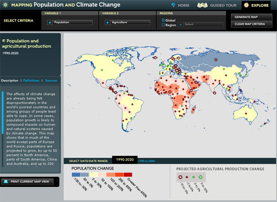
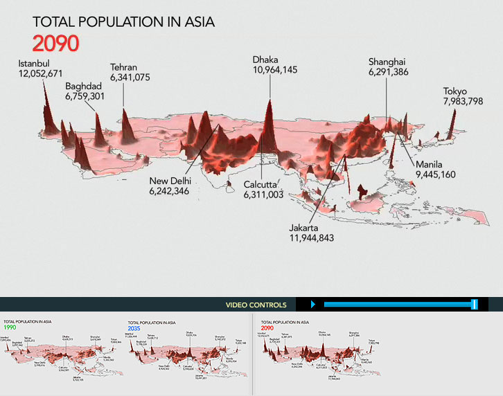
Mapping Population and Climate Change
›Climate change, population growth, unmet family planning needs, water scarcity, and changes in agricultural production are among the global challenges confronting governments and ordinary citizens in the 21st century. With the interactive feature “Mapping Population and Climate Change” from Population Action International, users can generate maps using a variety of variables to see how these challenges relate over time.
Users can choose between variables such as water scarcity or stress, temperature change, soil moisture, population, agriculture, need for family planning, and resilience. Global or regional views are available, as well as different data ranges: contemporary, short-term projections (to the year 2035), and long-term projections (2090).In the example featured above, the variables of population change and agricultural production change were chosen for the time period 1990-2020. Unfortunately, no country-specific data is given, though descriptions in the side-bar offer some helpful explanations of the selected trends.
In addition, users can view three-dimensional maps of population growth in Africa and Asia for the years 1990, 2035, and 2090. These maps visually demonstrate the projected dramatic increases in population of these regions by the end of the century. According to the latest UN estimates, most of the world’s population growth will come from Africa and Asia due to persistently high fertility rates.
Image Credit: Population Action International. -
Momentum Magazine
Where Does It Hurt? Climate Vulnerability Index
›The original version of this article appeared in the University of Minnesota’s Momentum Magazine. Text by Mary Hoff, page layout by Todd Reubold.
The punch climate change packs varies from one country, region, or continent to another. DARA, a Madrid-based humanitarian advocacy organization, recently partnered with the Climate Vulnerable Forum, comprising countries particularly vulnerable to climate change, to create Climate Vulnerability Monitor 2010, an atlas of vulnerability. This infographic presents a small portion of the picture the Climate Vulnerability Monitor paints.
Vulnerability is grouped into four categories: health impacts, weather disasters, habitat loss and economic stress. Circles on the left side of each set indicate relative magnitude of vulnerability in 2010. Circles on the right indicate the same for 2030.
See the full “Where Does it Hurt?” infographic on the Momentum site or download the Climate Vulnerability report from DARA.
Image Source: Climate Vulnerability Monitor 2010: The State of Climate Crisis, published in December 2010 by DARA (daraint.org). Used with permission. -
Watch Michael Renner on Improving Environmental Peacebuilding by Moving From the Technical to the Social
›“When we think about environmental peacebuilding opportunities…at a certain level it seems like a very straightforward, almost technical task,” said Michael Renner, senior researcher at the Worldwatch Institute, in this interview with ECSP. “But really stepping back, in a sense, this is far more than just a technical issue – it’s a broader social and, ultimately, political issue.”
As well as reducing tensions in conflict-prone areas, environmental peacebuilding – like reforestation and land/water management initiatives – can have a great impact on local livelihoods. Renner discussed the importance, therefore, of working alongside affected communities to address specific, long-term needs. “You need to have a buy-in from the local communities,” he said. “If you don’t, you may well undertake these efforts, but it’s not very clear how long they can last and how successful they can be.”
“I think it’s very important to understand these as challenges from an interdisciplinary point of view, that really require us not to think in terms of just ‘what’s the best technology, what’s the best practice,’” Renner said. “But also ‘how do we ensure really that this links up with the needs on the ground of specific communities?’” -
Mapping the Hot Spots of the 2010/11 Food Crisis
›If you’ve taken a trip to the supermarket lately or scanned the headlines you may have noticed something: Food prices are on the rise. Worldwide, food prices are on track to reach their highest point since their peak in 2008. Using data from the Food and Agriculture Organization (FAO), the International Food Policy Research Institute (IFPRI), and the World Bank, the Environmental Working Group (EWG) and ActionAid have collaborated to create an interactive world map called, “Hot Spots in the Emerging Global Food Crisis.”
The focus of the map is to highlight the 52 most at-risk countries where increases in staple food prices could tip the scales of stability. There are three variants of the map to choose from: countries at risk which depend on imported cereals, countries where prices are already increasing (featured above), and countries with vulnerable economies and high rates of hunger.Food prices have become a hot topic of conversation lately for their alleged role in the instability that is rocking the Middle East/North Africa region. But the Middle East is not the only area affected: Besides in Algeria, Tunisia, Morocco, Jordan, and Egypt, food-related riots and protests have also broken out in Mozambique, Bolivia, and India. As the map’s accompanying text puts it, these food riots “feed deeper discontent about economic inequalities and hunger and help give rise to revolutions that can topple governments, as in Tunisia and Egypt.”
Scrolling over a country reveals more information, like, for example, the specific percentage increases in the price of wheat or rice over the past year (wheat prices have risen 15.9 percent in China vs. 54 percent in Kyrgyzstan) or the amounts of corn, soybean, and wheat annually imported and exported (Afghanistan exported 908 million metric tons of wheat in 2010 while Egypt imported 4,978).
Users can also click on vulnerable countries to see how many people are malnourished and their per capita income per day. In the Democratic Republic of the Congo, for example, an estimated 42 million people were undernourished between 2005 and 2007, and the average person lives on $0.28 per day. According to EWG and ActionAid, the total number of people living in extreme poverty rose by 25 million in 2008 during the last global food crisis. Since June 2010, the start of the current upward trend in prices, the World Bank estimates that 44 million people have fallen into extreme poverty.
One recommendation from EWG and ActionAid for developed countries and the United States in particular: Stop looking to biofuels as an energy option. In their view, “spending scarce taxpayer dollars to shift crops from food to biofuels at the expense of hungry people and already stressed resources like soil, water, and air is unsustainable.”
Image Credit: Map courtesy of the Environmental Working Group and ActionAid, and Food Price Index and Food Commodity Indices, extracted from Global Food Price Monitor, January 2011, courtesy of the Food and Agriculture Organization.
Sources: ActionAid International, BBC News, CNN, the Environmental Working Group, The European Union Times, Time, Voice of America, World Bank. -
‘Blood in the Mobile’ Documents the Conflict Minerals of Eastern Congo
›With Blood in the Mobile, Danish director Frank Poulsen dives into the eastern Democratic Republic of Congo (DRC) to document a vicious cycle of conflict that has claimed millions of lives, produced rampant humanitarian abuses, and is driven in part (though not entirely, it should be noted) by the area’s rich mineral resources – all under the noses of the world’s largest peacekeeping operation.
The minerals extracted in the eastern DRC – tin, tantalum, tungsten, and gold, mainly from North and South Kivu provinces – are used in cell phones around the world. The trailer shows Poulsen gaining access to an enormous tin mine in the area – the biggest illegal mine in the Congo, he says – capturing powerful footage of the squalid and dangerous conditions that thousands of often-teenage workers labor under for days at a time.
“Four years ago this place was nothing but jungle,” narrates Poulsen. “Today, 15,000-20,000 people are working here [and] different armed groups are fighting to gain control over the mine.”
Though Poulsen is pictured making dramatic phone calls to Nokia (the largest cell phone manufacturer in the world), the issue of conflict minerals from the DRC and places like it is in fact more than just a blip on the radar screens of most leading technology companies. The NGO the Enough Project in particular has been championing the cause and bringing it to tech companies’ doorsteps for quite some time. Their efforts have helped produce an action plan for certifying conflict-free supply chains (complete with company rankings) and also helped lead to passage of the United States’ first law addressing conflict minerals this fall.
However, Poulsen’s message of the developed world taking responsibility for sourcing is commendable. Efforts like this that have led to the adoption of corporate responsibility initiatives like the Cardin-Lugar amendment, a similar measure in the works for the European Union, the Extractive Industries Transparency Initiative, and the Kimberley Process for diamonds.
Blood in the Mobile premiered this fall at the International Documentary Film Festival and the producers are “in dialogue with different U.S. distributors,” according to their Facebook page, where those interested are advised to stay tuned.
Sources: BloodintheMobile.org, Enough Project, EurActiv.
Video Credit: Blood in the Mobile Official Trailer. -
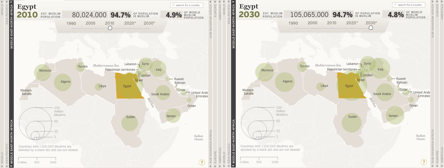
Mapping Muslim Population Growth
›Recent unrest in Tunisia, Egypt, Yemen, and elsewhere across the Middle East has led to a resurgence of interest in the region’s demography, just in time, it turns out, for the Pew Forum on Religion and Public Life’s 2011 refresh of its report on Muslim population growth, which this year includes a new interactive feature, “The Global Muslim Population.”
According to the report, current security hot-spots such as Afghanistan, Iraq, Yemen, Syria, Somalia, and Nigeria will continue to grow considerably faster than the mean.
On the flip side, the report also found that the median age in the Middle East-North Africa region is rising – a generally agreed upon good indicator for the prospects of more liberal, democratic regimes – and though global Muslim population will continue to grow faster than the world’s non-Muslim population, this growth will be slower than in decades past.The accompanying interactive feature allows users to select a region (the Americas, Europe, Middle East/North Africa, Sub-Saharan Africa, or Asia-Pacific), a specific country, and a decade (1990-2030) in their search. In the example above, Egypt will add 25 million Muslims to its population over the next two decades, representing a 30 percent increase. Comparatively, from 1990 to 2010, Egypt’s Muslim population increased by 48.5 percent.
The user is able to see the estimated Muslim population of the country, the percent of the total population that is Muslim, and the country’s percent share of the world’s total Muslim population (as seen in the example above of Egypt in 2010 and 2030). In addition, these variables can be sorted in tables.
It’s important to note though, write the authors of the report, that projections are not predictions:This report makes demographic projections. Projections are not the same as predictions. Rather, they are estimates built on current population data and assumptions about demographic trends; they are what will happen if the current data are accurate and the trends play out as expected. But many things – immigration laws, economic conditions, natural disasters, armed conflicts, scientific discoveries, social movements and political upheavals, to name just a few – can shift demographic trends in unforeseen ways, which is why this report adheres to a modest time frame, looking just 20 years down the road.
Image Credit: Pew Research Center’s Forum on Religion and Public Life.
Sources: Pew Forum on Religion and Public Life.