Showing posts from category Eye On.
-
Gidon Bromberg at TEDx on Peacebuilding Through Water in the Middle East
›“Cooperation over water is not a privilege, it’s a necessity,” said Gidon Bromberg, co-director of Friends of the Earth Middle East, in a TEDx talk at Yale. He sees the shortage of water in Jordan, Israel, and Palestine as an opportunity to bring these contentious communities together – even more so during this period of upheaval in the region.
Water woes have long contributed to regional tensions, said Bromberg. Water rights between Israel and Palestine were supposed to be settled during the Oslo accords in 1993, but negotiations were unsuccessful and water discussions were consequently left unfinished. The lack of formal negotiations caused each side to seize whatever resources they could Although Jordan was not part of the negotiations, it does share water resources with Israel and the West Bank and thus has been impacted by the lack of formal allocation processes. Both Jordan and Israel have diverted flow of the Jordan River into dams and irrigation projects. As a result, the Jordan River has lost 98 percent of its historic flow and the Dead Sea has lost one-third of its surface area.
Today, Israel has restricted Palestinian water use such that Palestinians have access to water only once a week in winter and once every three weeks in the summer, leading them to store water in containers on their roofs, Bromberg said. Though mismanagement is as much to blame as conflict, he notes, Palestinians chafe under the limitations.
Yet Friends of the Earth Middle East has used this difficult situation to educate the public, propose reforms, and build trust between Palestinian, Jordanian, and Israeli communities. Bromberg highlighted “fear of a small but vocal minority on both sides” as a key factor in preventing dialogue between the communities, but insists that water can bring people together. Neighboring communities have to work together, he said, “not because they’re best friends,” but to improve their own water situations.
Friends of the Earth provides that opportunity with their Good Water Neighbors project and hopes the trust built between communities extends beyond water issues as well. Since communities have strong motives to solve these problems, they work together more effectively than high-level politicians who may not be as apt to collaborate.
A positive update on the state of the Jordan River given in an interview with ECSP in October suggests that Bromberg may be on to something.
Sources: Amnesty International, Friends of the Earth.
Video Credit: TEDx. -
Full Extent of Africa’s Groundwater Resources Visualized for the First Time
›“In Africa, groundwater is the major source of drinking water and its use for irrigation is forecast to increase substantially to combat growing food insecurity,” yet, a lack of quantitative data has meant that “groundwater storage is consequently omitted from assessments of freshwater availability,” according Alan Macdonald, Helen Bonsor, and Brighid Dochartaigh of the British Geological Survey, and Richard Taylor of University College London, writing in Environmental Research Letters.
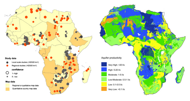
The authors hope to remedy this with new research presented in “Quantitative Maps of Groundwater Resources in Africa.” They used estimates compiled from geologic data and 283 aquifer summaries from 152 different publications to quantitatively visualize, for the first time, the full extent of Africa’s groundwater resources.
Tapping a Hidden Resource
The study estimates the scale of the continent’s groundwater resources at around 0.66 million km3. This volume, the authors explain, is “more than 100 times the annual renewable freshwater resources, and 20 times the freshwater stored in African lakes.”
Tapping into this massive resource is not always straightforward, however. The largest aquifers, and those most able to support high yielding bores, are concentrated in the arid regions of North Africa. The depth of these aquifers and their distance from major populations creates substantial economic challenges for extraction.
The geographic distribution of aquifers across sub-Saharan Africa is also quite variable, and local geology can determine not just the availability and accessibility of water but also its quality. For instance, geologic specificities can result in elevated levels of arsenic and other undesirable chemicals. Furthermore, “contamination…is common in urban areas from widespread and dispersed faecal effluent from on-site sanitation and leaking sewers.”
Tempering Expectations
Throughout Africa, “groundwater provides an important buffer to climate variability and change,” say the authors. But these buffers are not a singular solution to the threat of future water scarcity.
As the analysis shows, most aquifers, especially south of the Sahara, are unlikely to sustain boreholes of a higher capacity than that required by community-level hand pumps (one liter per second of flow at minimum). Yet, commercial irrigations schemes and urban towns typically demand boreholes greater than five liters per second, according to the study.
So, groundwater extraction may help communities and some small-scale farmers maintain access to water, particularly because many aquifers are found to possess the storage capacity required “to sustain abstraction through inter-annual variations in recharge,” however, “strategies for increasing irrigation or supplying water to rapidly urbanizing cities that are predicted on the widespread drilling of high yielding boreholes are likely to be unsuccessful.” Especially, the authors assert, where drilling precedes detailed local scale mapping of the available resources.
Sources: Environmental Research Letters.
Image Credit: Figures 1 and 3, courtesy of Environmental Research Letters. -
Invest in Women’s Health to Improve Sub-Saharan African Food Security, Says PRB
›“Future food needs depend on our investments in women and girls, and particularly their reproductive health,” says the Population Reference Bureau’s Jason Bremner in a short video on population growth and food security (above). Understanding why, where, and how quickly populations are growing, and responding to that growth with integrated programming that addresses needs across development sectors, are crucial steps towards a food secure future, he says.
Reducing Food Insecurity by Meeting Unmet Needs
In sub-Saharan Africa, where nearly one-fourth of the population lives with some degree of food insecurity, persistently high fertility rates help drive population growth, according to the policy brief that accompanies Bremner’s video.
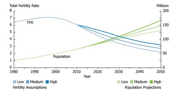
On average, women in the region have 5.1 children, more than twice the global average total fertility rate (TFR) of 2.5. The United Nation’s medium-variant projections (which Bremner notes are often used to predict future food need) show the region more than doubling in size by 2050, but that projection rests on the assumption that the average TFR will drop to three by mid-century.
As many as two-thirds of sub-Saharan African women want to space or limit their births, but do not use modern contraception. While the reasons for not using modern contraception are many, ranging from cultural to logistical, the lack of funding for family planning and reproductive health services remains a serious impediment to improving contraceptive prevalence and, in turn, lowering fertility rates.
“Current levels of funding for family planning and reproductive health from donors and African governments fail to meet current needs, much less the future needs,” writes Bremner.
Almost 40 percent of the region’s population is younger than 15 years old and has “yet to enter their reproductive years,” writes Bremner. “Consequently, the reproductive choices of today’s young people will greatly influence future population size and food needs in the region.”Fertility Assumptions and Population Projections in the Democratic Republic of Congo
Family Planning Is One Piece of an Integrated Puzzle
Increasing funding for family planning services would be a boon to the region, but Bremner cautions that viewing sub-Saharan Africa’s rapid population growth solely from a health perspective and in isolation from other development needs would be inherently limiting.
“Slowing population growth through voluntary family planning programs demands stronger support from a variety of development sectors, including finance, agriculture, water, and the environment,” Bremner writes. A multi-sector approach that addresses population, health, livelihood, and environment challenges could mitigate future food insecurity more effectively than single-track programming that addresses sub-Saharan Africa’s various development needs in isolation from one another.
Improving women’s role in agriculture, for example, could help minimize food insecurity on a regional scale, Bremner writes. Women make up, on average, half the agricultural labor force in sub-Saharan Africa, and yet it is more difficult for them to own arable land, obtain loans, and afford basic essentials like fertilizer that can help boost agricultural productivity. Furthermore, women’s traditional household responsibilities, like fetching water, often cut into the amount of time they are able to give to farming. With those limitations lifted, women could offer enormous capacity for meeting future food needs.
Given the complex and interconnected nature of the development challenges facing sub-Saharan Africa, integrated cross-sector programming, with an emphasis on meeting family planning needs, is essential to reducing total fertility rates while improving food security over the long-term, according to Bremner.
“Investments in women’s agriculture, education, and health are critical to improving food security in sub-Saharan Africa,” he writes.
“Improving access to family planning is a critical piece of fulfilling future food needs,” he adds, “and food security and nutrition advocates must add their voices to support investments in women and girls and voluntary family planning as essential complements to agriculture and food policy solutions.”
Sources: Population Reference Bureau.
Video Credit: Population Reference Bureau. -
Peacemakers or Exclusion Zones? Saleem Ali on Transboundary Peace Parks
› “Traditionally, natural resources have been thought of as a source of conflict…but what we’ve been trying to do is look at the other side of the story, which is that natural resources, in terms of their quality, can create that impulse for conservation and cooperation,” said Saleem Ali, professor of environmental studies and director of the Institute for Environmental Diplomacy and Security at the University of Vermont, while speaking at the Wilson Center.
This narrative around peace parks or transboundary conservation areas that are used for peacebuilding is a relatively recent field of research, said Ali. “It’s one thing to have a protected area on a border and have cooperation between friendly parties – like the U.S. and Canada,” he said, “and it’s a totally different thing to explore this in areas where there’s a history of protracted violent conflict.”
Yet, Ali said, we have “a good institutional framework for understanding what kind of parks could potentially be developed.” Cooperation between Ecuador and Peru in the Cordillera del Condor protected area, for example, is an incidence where transboundary conservation was actually written into the peace process between two warring states. Recent tragedies on the Siachen glaciers highlight another case where calls have been made to use peace parks as a way to demilitarize a contentious border over which India and Pakistan have long argued.
Questions remain though about the capacity of conservation processes to sustain peace, and “whether micro-conflicts that might arise through any conservation being practiced can be managed effectively.” Peace parks established in South Africa after apartheid, for example, produced “micro-conflicts between the haves and the have-nots – the classic conflict between conservation as an exclusionary arena versus a more inclusionary vision.”
“A lot of those organizations have learned from those past mistakes and we’re moving in the right direction,” Ali said, “but that’s still an area that requires far more research, and also more applied work, to find the right mix of conservation and economic development.” -
Geoff Dabelko on Finding Common Ground Among Conservation, Development, and Security at the 2011 WWF Fuller Symposium
› Bridging the divide between the conservation and security communities “requires that we check some stereotypes at the door,” said ECSP’s Geoff Dabelko at the World Wildlife Fund’s Conservation Forward: Ideas That Work and How Science Can Effect Change symposium. Changes in global climate, as well as environmental threats more local in origin, require us to “find ways to minimize threats [and] maximize opportunities…from the dialogue between these different communities – and get out of our silos to do that,” said Dabelko.
However, this dialogue faces real challenges and concrete trade-offs. “There are big imbalances in terms of the resources that these different communities have,” and this often cuts the conversation short, he said. The conservation and security communities are also orientated towards some very different objectives and toolsets. But “given the levels of stress that our natural systems are under, given the level of dysfunction that are political systems are exhibiting, to me, it suggests that it’s a call for all hands on deck,” asserted Dabelko.
“The relationship between environment, natural resources, and violent conflict” is not the “only part of the story,” he said. Conservation goals can be achieved by preserving biodiversity on military sites and demilitarized zones, and through the Department of Defense’s new focus on reducing energy consumption. In the past, Russian-Norwegian-U.S. cooperation around de-commissioning Soviet-era nuclear submarines protected fragile Arctic habitats, prevented potentially dangerous technology from reaching world markets, and built confidence between recent adversaries. The dual potentials of “peace parks” in fragile and insecure borders across the Middle East have also garnered attention.
Environmental Peacebuilding
“Too often…natural resources are viewed as luxury items – what you worry about once you get rich, democratic, and peaceful,” yet, the environment is an “essential ingredient” for peace, Dabelko said. It is often “key to restoring livelihoods and jump-starting the economy” in conflict affected countries.
“Under a rubric or umbrella that we’re calling ‘environmental peacebuilding’ we have systematic efforts to…break those links with conflict,” he said. The future “concern is that because of environmental change, growth in population, growth in consumption,” and rampant inequities, climate change will act as a “threat multiplier.” “A risk analysis frame” is required to think through not only the risk of failing to act but also the risk of acting in ways that have the potential to create conflict if done poorly.
“We’re talking about changing access to resources and introducing money into uncertain political contexts – who gets it for what. That can be done well and that can be done poorly, and if you are talking to the folks in the conflict community, that’s often an inflection point for when conflict is a potential,” Dabelko said. In the context of potentially troublesome adaptations such as biofuel production, hydropower projects, and REDD+, this means taking seriously the well-worn, but apt, mantra of “do no harm” and working to maximize the “triple bottom line” of development, peace, and climate stability.
A question and answer period, moderated by USAID’s Cynthia Gill, followed the presentation with fellow speakers Anne Salomon of Fraser University, Michael Jenkins of Forest Trends, and Martin Palmer from the Alliance of Religions and Conservation (available below). -
International Research Institute for Climate and Society
Ethiopia Provides Model for Improving Climate, Other Data Services in Africa
›The original version of this article appeared on the International Research Institute for Climate and Society (IRI).
In developed countries, we are accustomed to having access to long and detailed records on weather and climate conditions, demographics, disease incidence, and many other types of data. Decisionmakers use this information for a variety of societal benefits: they spot trends, fine-tune public health systems, and optimize crop yields, for example. Researchers use it to test hypotheses, make forecasts, and tweak projections from computer models. What’s more, much of these data are just a mouse click away, for anyone to access for free (see examples for climate and health).
Across much of Africa, however, it’s a different story. By most measures, Africa is the most “data poor” region in the world. Wars and revolutions, natural and manmade disasters, extreme poverty, and unmaintained infrastructure, have left massive gaps in socioeconomic and environmental data sets. Reliable records of temperature, rainfall, and other climate variables are scarce or nonexistent. If they do exist, they’re usually deemed as proprietary and users must pay to get access. This is not an inconsequential matter. Without readily available, reliable data, policy makers’ ability to make smart, well-informed decisions is hobbled.
The problem of data access persisted even in Ethiopia, regarded as having one of the better meteorological services on the continent. Thanks to the recent efforts of Tufa Dinku, a climate scientist at the International Research Institute for Climate and Society, the situation has improved considerably.
Continue reading on IRI.
Video Credit: Overview of Ethiopia Climate Maprooms, courtesy of IRI. -
Kaitlin Shilling: Climate Conflict and Export Crops in Sub-Saharan Africa
› “There’s been a tremendous amount of work done on looking for a climate signal for civil conflict, particularly in sub-Saharan Africa, and a lot of this work draws a very clear and simple path – if it rains more, or if it rains less, there will be more or less conflict,” says Stanford University’s Kaitlin Shilling in this short video interview. Unfortunately, that straightforward research does little in the way of helping policymakers: “the only way to change the agricultural outputs due to climate change is to change climate change, reduce climate change, or stop it,” she says, “and we’re not really good at that part.”
Shilling moderated a panel at last month’s National Conference on Science, Policy, and the Environment on climate-conflict research. Agricultural export crops – cotton, coffee, cocoa, tea, vanilla – represent one area where policymakers might be able to intervene to prevent climate-driven conflict, says Shilling. Though not as important from a food security perspective, “these crops are really important” for sub-Saharan economies, as well as for “government revenues, which [are] closely related to government capacity.”
But “the effects of climate change on those crops are less well understood,” Shilling says. How they relate to “government revenues and how those relate to civil conflict is an area that I spend a lot of time doing research on.”
By “understand[ing] the mechanisms that underlie the potential relationship between climate and conflict, we can start identifying interventions that make sense to reduce the vulnerability of people to conflict and help them to adapt to the coming climate change.” -
‘Dialogue TV’ With Sharon Burke, Neil Morisetti, and Geoff Dabelko: Climate, Energy, and the Military
›We are entering “an emerging security environment” where “what constitutes a ‘threat’ and what constitutes a ‘challenge’” requires a broader understanding of security than has often been the norm, according to Sharon Burke, Assistant Secretary of Defense for Operational Energy Plans and Programs. Burke was joined by the UK’s Climate and Energy Security Envoy Rear Admiral Neil Morisetti and ECSP’s Geoff Dabelko on a new installment of Dialogue TV. They debated what climate change and energy security mean for the world’s militaries.


