-
Mapping Climate Security: New Dashboard Tool Visualizes Complex Vulnerability in Asia
July 25, 2018 By Olivia Smith
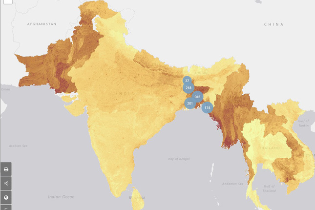
In many parts of South and Southeast Asia, high population density and vulnerability to climate change combine with low levels of household resilience and poor governance to increase security concerns and the potential for political instability. To help identify risks and hotspots in this critical region, the Complex Emergencies and Political Stability in Asia (CEPSA) program at the University of Texas-Austin recently launched the Complex Emergencies Dashboard, which integrates raw data and modeling with mapping technology, allowing users to visually analyze regional security issues. The project was funded by the Department of Defense’s Minerva Initiative, which also supported similar work by the university’s Climate Change and African Political Stability (CCAPS) program.
CEPSA’s Dashboard includes four datasets:
- Climate Security Vulnerability, a composite of many indicators
- Conflict
- Climate and Disaster Aid (Bangladesh only)
- Disaster Preparations (India only)
In addition to these four sources, users can also add any ArcGIS-compatible dataset—a feature that is one of the dashboard’s greatest assets.
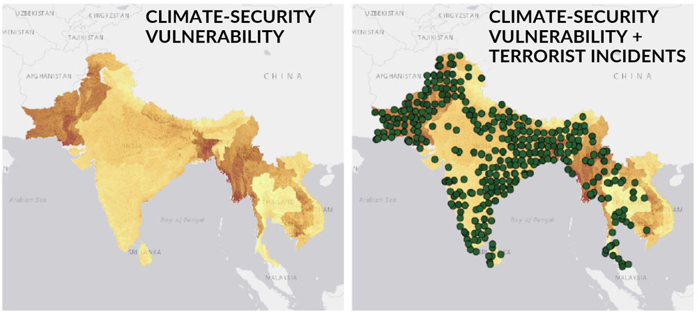
Another useful feature is the ability to compare two maps to visualize vulnerabilities. For instance, we can compare CEPSA’s Climate Security Vulnerability composite to the Terrorist Events dataset compiled by the University of Maryland. CEPSA’s Climate Security Vulnerability model (left, in the figure below) combines data in four categories: climate exposure, population density, household resilience, and governance. By overlaying terrorist incidents (right), we see that terrorist incidents are clustered in areas of higher climate security vulnerability.
Another particularly valuable feature is the “country story.” For example, Bangladesh’s country story describes the country’s high vulnerability to climate-related threats, illustrated with graphs demonstrating its high incidence of conflict. CEPSA estimates that 86 percent of Bangladesh’s population faces climate exposure above the regional average.
The complexity of the features and datasets are both an advantage and a challenge of the dashboard. Users can garner great insight from its tools, but the process of creating maps that are easy to grasp is time-consuming and the map legends can be confusing given the different scales used for the model’s indicators. In addition, the Country Stories can’t be exported or downloaded, making it hard to share these useful snapshots with busy policymakers. Finally, although the dashboard covers eleven Asian countries, it would have been interesting to see how China, Indonesia, and the Philippines compared to their immediate neighbors.
The dashboard’s maps offer an excellent visualization of complex and abundant data. But there are limitations to what we can infer from them, as overlaying different datasets does not indicate there are causal relationships between them. As CEPSA project leader Josh Busby explains, maps simplify complex circumstances at the risk of omitting critical detail. The dashboard and other map-based resources must be understood as one resource among many in an analyst’s toolkit.
The dashboard offers analysts a valuable interface for recognizing climate-security connections, using new datasets based on an innovative approach to assessing vulnerability. It promises to enrich researchers and analysts’ efforts to understand the interplay between the complex risks in the region. With additional investment in more countries and easier-to-access outputs, the dashboard could help a broader range of policymakers and planners get the information they need to better prepare for and respond to the complex emergencies to come.
Sources: The Armed Conflict Location & Event Data Project, The University of Texas at Austin
Topics: climate change, conflict, data, development, environment, environmental security, Eye On, featured, security
 A Publication of the Stimson Center.


