“Every crisis is complex, and the Sahel is no exception,” wrote USAID Assistant Administrator Nancy Lindborg in a recent
Huffington Post article that called for “smarter programming and a coordivenated response” to chronic crises. “A regional drought has been overlaid with instability stemming from the coup in Mali and conflict in the northern part of that country where armed militant groups have forced the suspension of critical relief operations” and led to refugee movement into neighboring countries simultaneously challenged by drought and crop infestation. Understanding the
complexity of this type of crisis, let alone visualizing the multiple factors that come into play, is a growing challenge for policymakers and analysts.
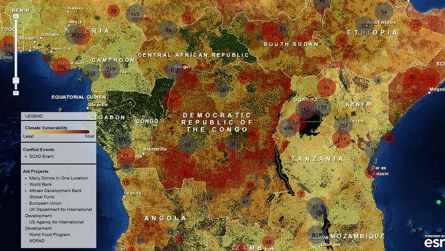
Enter version 2.0 of a mapping tool created by the Climate Change and African Political Stability Program (CCAPS) housed in the Robert S. Strauss Center for International Security and Law, based at the University of Texas, Austin.
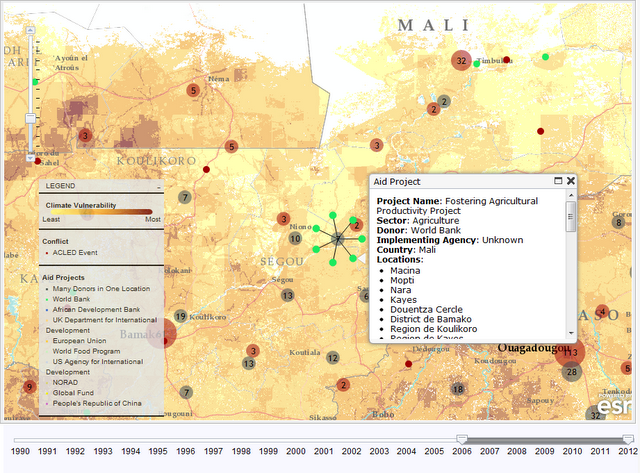
In collaboration with the College of William and Mary, Trinity College, and the University of North Texas, and with funding by the U.S. Department of Defense’s Minerva Initiative, CCAPS originally launched the mapping tool in March of this year. The map is powered by mapping and data tools from Esri and allows users to view any combination of datasets on international development projects, national governance indicators, incidences of conflict, and climate vulnerability data.
With an intuitive interface and compelling visuals, the mapping tool is a valuable resource for policy analysts and researchers to assess the complex interactions that take place among these environmental, political, and social factors. Advanced filters allow the user to identify a subset of conflicts and aid projects and there are nine base map styles from which to choose.
 The mapping tool is anything but static. The team is constantly working to refine and enhance it through the inclusion of additional indicators and improvement of the interface. The updated version now includes CCAP’s new Social Conflict in Africa Database, which tracks a broad range of social and political unrest, and their partners’ real-time conflict dataset, the Armed Conflict Location and Event Dataset (ACLED), which tracks real-time conflict data. Impressively, the ACLED data will be updated weekly.
I asked CCAPS program manager Ashley Moran to clarify how the governance indicators work in the model. She explained: The national governance indicators are included in one of four baskets that make up the climate vulnerability model…and represent four potential sources of vulnerability: physical exposure to climate-related hazards, population density, household and community resilience, and governance and political violence. They used the term “basket” since most include several indicators that reflect the full dimensions of that source of vulnerability. The fourth basket includes five national governance indicators and one indicator of political violence.
Moran also shared plans to add more detailed national governance data to the map: We are developing a mapping tool specifically for the climate vulnerability model, which will allow users to see the component parts of the model. It will allow users to re-weight the baskets (e.g. if a user thought governance should have more weight within the model since the government response to climate hazards is key), and it will also allow users to examine an area’s vulnerability to just one or two baskets of the user’s particular interest (instead of all four baskets combined as the tool does now). When we launch this, a user will essentially be able to see the vulnerability model disaggregated into its component parts, so they’ll be able to map just the governance data in the model, if they want.
In the coming months, the CCAPS team will add more detailed historical and projected data on climate vulnerability, data on disaster response capacity, as well as international aid projects coded for climate relevance.
Each of these datasets on their own are a wealth of vital information, but understanding how they intersect and the potential impact of their interactions is crucial to improving our understanding of them individually and collectively and creating responses that are timely and long-lasting.
If you’re in the San Diego area next week, check out Ashley Moran’s presentation of the mapping tool at the Esri International User Conference and the Worldwide Human Geography Data Working Group.
Sources: The Climate Change and African Political Stability Program, The Huffington Post.
Image Credit: CCAPS
 The mapping tool is anything but static. The team is constantly working to refine and enhance it through the inclusion of additional indicators and improvement of the interface. The updated version now includes CCAP’s new Social Conflict in Africa Database, which tracks a broad range of social and political unrest, and their partners’ real-time conflict dataset, the Armed Conflict Location and Event Dataset (ACLED), which tracks real-time conflict data. Impressively, the ACLED data will be updated weekly.
 A Publication of the Stimson Center.


